Detecting the client device easily with device.js
Quick note regarding device detection on JavaScript
Do you find yourself creating "isMobile" variables in Javascript quite often? What about manually adding a "mobile" or "tablet" class to the body or the HTML tag? If you fall into that group, pay attention to this! Don't waste your time anymore. Just use this super useful and easy library called device.js.
Device.js makes it easy to write conditional CSS and/or JavaScript based on the device operating system (iOS, Android, Blackberry, Windows, Firefox OS, MeeGo, AppleTV, etc), orientation (Portrait vs. Landscape), and type (Tablet vs. Mobile).
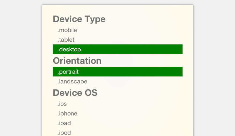
Device.js will update automatically the classes in the HTML tag based on the device and orientation. Example:
<html lang="en" class=" desktop portrait">
When I change my user agent to iPad iOS 6, it shows:
<html lang="en" class="ios ipad tablet portrait">
Then you can use those classes to style your website accordingly.
At the same time, on JavaScript, you can access the same information like this:
device.portrait() === true
device.landscape() === false
device.mobile() === false
device.tablet() === false
device.ipad() === false
device.ipod() === false
device.iphone() === false
device.android() === false
device.androidTablet() === false
device.blackberryTablet() === false